There are a lot of free and paid brand fonts to choose from. Google Fonts alone has 1542 free font families. Most of Google’s fonts, if not all of them, are uploaded and available in Showit. You can also buy custom fonts from places like Creative Market and add them to your website. Font selection can make a huge difference in how your brand is perceived so it’s important to make a great choice the first time.
That’s why I’m going over in this blog how to choose a brand font for your website that matches your brand vibe and is easy to read.
First, Let’s Go Over What Types of Fonts There are to Choose from
Usually, fonts are broken into 3 different groups serif, sans-serif and script but Google Fonts, for example, has its fonts grouped into 5 different categories:
Serif Fonts
Serif fonts have feet at the ends of the letters.
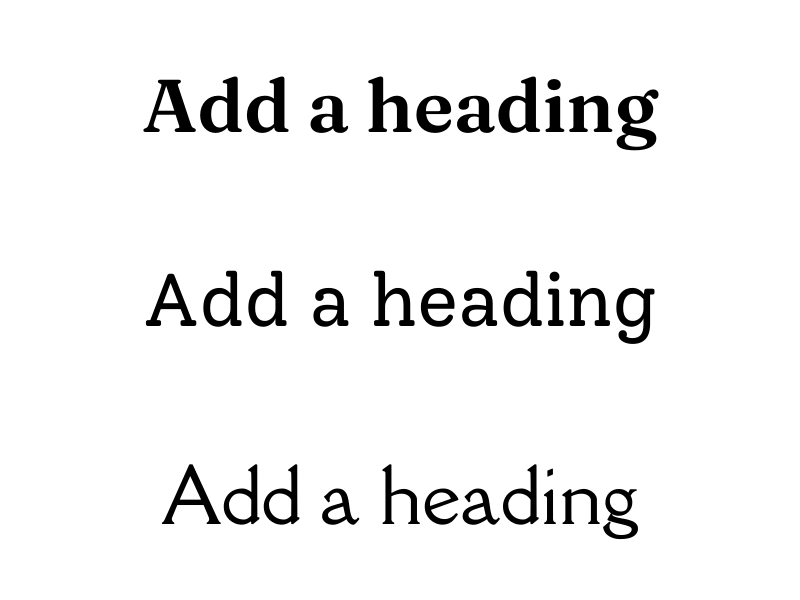
Sans-Serif Fonts
Sans means without, so sans-serif fonts do not have feet.
Script Fonts
Script fonts are sometimes referred to as handwriting or cursive fonts.

Now Let’s Go Over How to Choose a Brand Font for Your Website
Choose Fonts that are Easy to Read (<<< This is the MOST IMPORTANT One)
Script fonts can be hard to read if they are used for paragraph text and being able to read the words on your website is the top priority! If someone can’t read the words on your website they’ll probably leave and go to someone else’s website. Not did you lose a potential client but if people are constantly leaving your website it will affect your Google bounce rate which isn’t good for your website’s organic search.
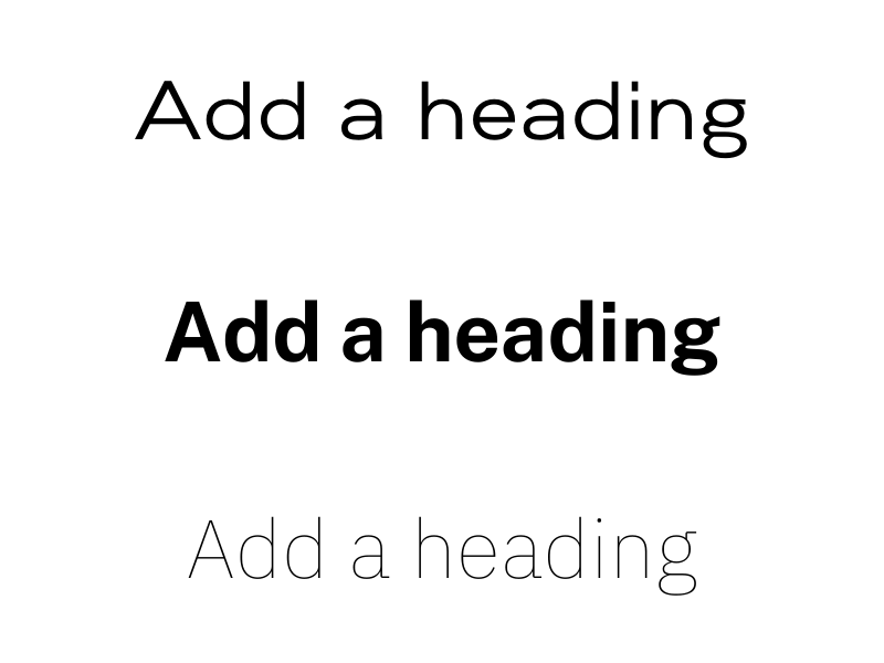
Don’t Use Too Many Fonts (2-3 is Best)
If you use too many fonts, your website will look messy and unprofessional. Ideally, you should use only one or maybe two fonts for your headings and one font for your paragraph text. 3 fonts total is the maximum amount of fonts you should use.
Font Pairings
If you choose more than one font you’ll probably want to choose them from different font categories. For example, if you use a serif font for your heading you might want to use a sans-serif font for your paragraphs. You can use two fonts from the same category, but make sure that the fonts look different enough from each other to add contrast.
Make Sure Your Fonts are Available on Any Platform You Need to Use them
If you’re using Showit for your website most Google fonts are already preloaded and can be easily added to your website. You can also add a custom font to your Showit website. On the flip side, not all of Google’s fonts are available in Canva but can be uploaded to the platform if you’re on the paid plan.
Test Out Your Brand Fonts on Different Types of Media
Make sure to test your fonts on your website’s mobile and desktop view. Also, test your fonts out on a social media graphic. Sometimes fonts will look great on a smaller item like a social media graphic, but trying it your website’s desktop view won’t look as good.
Did You Like This Blog Post?
If So, Make Sure to Pin it on Pinterest!